I have finished coloring my oil container and have begun adding the other elements. You can see a flower at the spout of the oil container, I also have a hummingbird image to include.
Sylvia, I love your idea for this project! One of my favorite musicals is Little Shop of Horrors, where the main character is a carnivorous plant, so I'm excited to see where your imagination takes you. So far, I think you've beautifully captured the delicate transparency of the original glass from your reference picture. Much like the visual depth you've created using texture for your cork, I wonder what some of that texture might look like on your flower petals. I think you're advancing nicely, and I'm looking forward to see the whole composition including the hummingbird!
Beautiful transparency! It translates over as a hummingbird feeder so well while still looking like the original oil container; your concept is communicated very clearly. I do think making the flower a brighter color (like maybe red) would help communicate that there is a flower coming out of the spout; and even draw attention to the potential underlying meaning of this piece.
The transparency is really impressive here! I also love the texture on the cork, it looks great. I think that coloring the flower is a really great idea, it would provide a wonderful emphasis on that side of the composition. You could also add another burst of color of some kind in the bottom left corner to create an implied line that becomes interesting to the viewer!
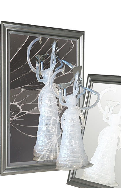
I took some pictures of my statue to play with in Photoshop. I considered adding a ton more mirror shards to the statue itself, but decided it was time to start incorporating digital imaging into the piece.
Trying to think of a reason for creating this statue, I definitely had a subconscious reason behind this piece, and a faint idea of how to express it. It's about my complicated relationship with my face and mirrors. I had struggled with severe acne for about six years, starting from the tender age of 14. It was something that sadly influenced me a lot as I was growing up and through my teen years. Over the years it created a lot of self-hatred, low self-esteem, and depression. Things that even now, although my skin is doing much better, still effect me and that I am still insecure about. Gradually throughout those years of really disliking my face, I had taught myself to avoid looking into reflective surfaces, or looking at myself in full light. After so much time this behavior became second nature, and even though I feel a lot better about my face now, I still find myself turning on the low light, or trying to avoid reflections. Whi...
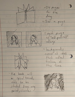
After having some time to think about the assignment and what might be both a fun and creative project, I think I have found my idea! I intend to make a small spiral-bound book, bound so that the pages can go 360 degrees around. The book will have 24 pages, one for each hour of the day. There will be no set start or end to the book, it will be a day cycle so you could open at any page and go through it. For each hour (page) I'm thinking it will be a self portrait of sorts of how I'm feeling in that hour. I'll take a few self portrait photos of the hour and paste them together collage-style. For the backgrounds I would like to use abstract color to represent the feel of the hour. I hope that made even a little sense!

Sylvia, I love your idea for this project! One of my favorite musicals is Little Shop of Horrors, where the main character is a carnivorous plant, so I'm excited to see where your imagination takes you. So far, I think you've beautifully captured the delicate transparency of the original glass from your reference picture. Much like the visual depth you've created using texture for your cork, I wonder what some of that texture might look like on your flower petals. I think you're advancing nicely, and I'm looking forward to see the whole composition including the hummingbird!
ReplyDelete((This is also Elena Sanchez commenting))
DeleteBeautiful transparency! It translates over as a hummingbird feeder so well while still looking like the original oil container; your concept is communicated very clearly. I do think making the flower a brighter color (like maybe red) would help communicate that there is a flower coming out of the spout; and even draw attention to the potential underlying meaning of this piece.
ReplyDeleteThe transparency is really impressive here! I also love the texture on the cork, it looks great. I think that coloring the flower is a really great idea, it would provide a wonderful emphasis on that side of the composition. You could also add another burst of color of some kind in the bottom left corner to create an implied line that becomes interesting to the viewer!
ReplyDelete